Why Simple Features Take the Most Work in Product Development
.png&w=3840&q=75)
“Can you just add a button?”
If you’ve ever worked on building digital products, you’ve probably heard this sentence before. And maybe—like many product teams—you’ve learned that there’s no such thing as just a button.
Simple features often hide layers of complexity beneath their surface. They look effortless to the user, but behind the scenes are dozens of design decisions, technical trade-offs, and cross-team alignments. In this article, we’ll explore why simple features are rarely simple, and why putting in the work to get them right pays off in user trust and loyalty.
Why “Simple” Is Never Simple
The Myth of Easy Features
From the outside, a single button seems straightforward: design it, place it, code it. But once development begins, questions pile up quickly:
-
What happens if a user clicks it twice?
-
Should it look the same on mobile and desktop?
-
Does it trigger an action immediately, or does it require confirmation?
-
What if the network connection drops mid-action?
Each question adds a new branch of logic, a new state to handle, or an additional safeguard to prevent errors. The “just a button” myth ignores the invisible work of ensuring that every interaction behaves predictably, no matter the context.
Layers of Hidden Decisions
Simple features are rarely stand-alone. Their behavior depends on where they appear, who uses them, and what system rules apply. For example:
-
Placement: A button positioned on the top bar for desktop may need to move to a floating bottom element on mobile for accessibility.
-
Permissions: Should all users see it, or only those with specific roles? If permissions change, how does that affect the interface?
-
Connectivity: Offline and online states introduce complexity. What happens if the action is triggered offline—does it queue, fail silently, or prompt the user?
Each of these decisions feels small but compounds into a complex web of logic that must stay invisible to the user.
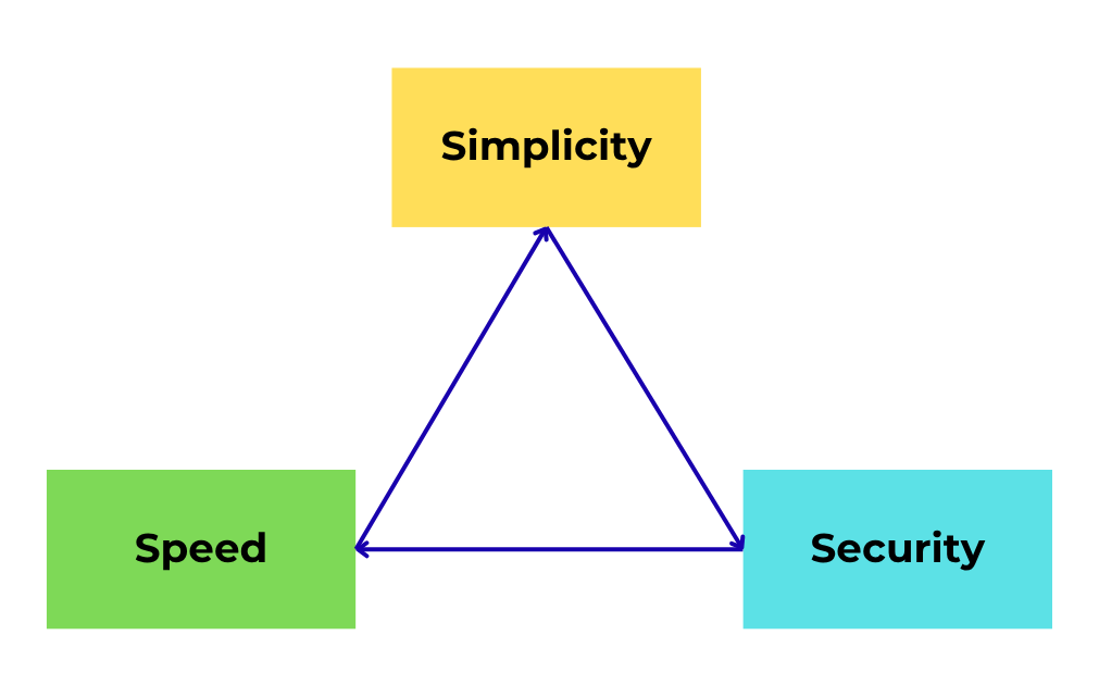
Simplicity vs. Speed vs. Security
Product teams often face three competing priorities:
-
Simplicity: Make it easy to understand.
-
Speed: Make it fast to use.
-
Security: Keep it safe and reliable.
A feature that prioritizes speed (e.g., instant one-click checkout) might compromise security (e.g., accidental purchases, no fraud check). Conversely, adding extra confirmations or authentication steps improves security but disrupts flow. Striking the right balance takes careful planning—and often more time than building the feature itself.
|| Read more: Vibe Coding Explained: What it is, How it works, Is it real fast & simple?
The Real Work Behind Seamless UX
Designing for Every Edge Case
The mark of a well-built product isn’t just what happens when everything works; it’s how it behaves when things go wrong. Every “what if” scenario must be accounted for:
-
What if the user closes the app mid-process?
-
What if two actions happen simultaneously (e.g., double-clicking)?
-
What if the system receives outdated or partial data?
These edge cases rarely make it into user-facing descriptions, but handling them prevents frustration and builds trust. A single unhandled error can make an otherwise “simple” feature feel broken.
Cross-Team Complexity: Design, Development, Operations
Behind every seemingly effortless user interaction lies cross-functional collaboration:
-
Design ensures the feature feels intuitive and consistent with the brand.
-
Development implements logic, manages state, and ensures system compatibility.
-
Operations (or QA, DevOps, etc.) validate performance, uptime, and data integrity.
Coordinating across these teams means aligning timelines, translating requirements, and negotiating trade-offs—work that rarely appears in release notes but defines product quality.
Why Users Only Remember the Easy Part
End users don’t care about the complexity behind the curtain. They won’t praise your elegant code or intricate backend logic. They care about one thing: does it work, and does it feel effortless?
This is why investing extra time in “simple” features pays dividends. Users rarely applaud “complex but powerful,” but they always remember “easy and works right away.” When the experience feels seamless, adoption grows organically, and customer trust deepens.

Building Simple Systems the Right Way
Trust the Process (and Its Messiness)
Creating simplicity isn’t about cutting corners; it’s about designing, testing, and refining until complexity disappears from the user’s view. This process is inherently messy:
-
Prototyping and scrapping ideas that looked good on paper but fail in real usage.
-
Iterating on microinteractions (loading spinners, confirmation states).
-
Running multiple rounds of QA to ensure no edge case slips through.
Teams that trust this iterative process—and embrace the chaos upfront—are rewarded with a product that scales gracefully later.
When to Say “No” to Extra Features
Feature creep is one of the fastest ways to turn a clean product into an overwhelming one. Adding “just one more” option often introduces exponential complexity in flow, testing, and maintenance.
A disciplined approach asks:
-
Does this feature solve a real user pain point?
-
Will it simplify or complicate the overall experience?
-
Can we defer it to a later phase without breaking the core product?
Saying “no” preserves focus and protects the simplicity users value most.
A Checklist for Simplicity in Tech Products
To keep “simple” features truly simple, product teams can apply these principles:
-
Optimize the flow – Reduce unnecessary steps between intent and outcome.
-
Minimize cognitive load – Use familiar patterns and clear language.
-
Prioritize user needs – Solve the core problem first; add extras later.
-
Test edge cases early – Simulate failures (offline, errors, double clicks) before launch.
-
Review continuously – Revisit features as the product evolves; what’s simple today may become complex tomorrow.
Simplicity isn’t free.
It’s built through careful planning, cross-team alignment, and relentless iteration.
The harder the process feels today, the smoother it will feel to users tomorrow.
Want more insights on building scalable digital products? Explore our Egitech Blog for articles on product strategy, engineering best practices, and real-world case studies.